Responsive Lab
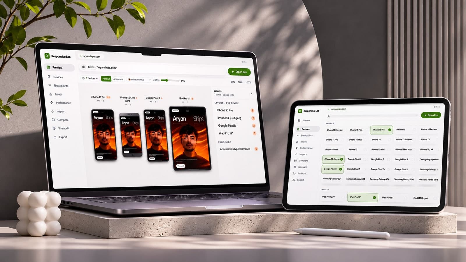
Any deployed URL across a catalogue of real device mockups, with its breakpoints found and its responsive faults named.
[ The transformation ]
Checking a build across devices means dragging a window and trusting your eye, or paying for a service that screenshots your site on someone else’s machine. Neither tells you WHERE a layout actually breaks.
Built and live, iterating on the analysis views and the canvas.
[ The hard problem ]
Rendering someone else’s site inside your own and still being able to measure it means defeating the same-origin boundary honestly — a proxy that rewrites enough to let the analysis read the DOM, without rewriting so much that what you are measuring stops being their page.
[ How it works ]
A web app that loads a live site into real device frames side by side, finds the widths at which its layout changes, and flags the faults that cause most responsive bug reports — overflow, unsized media, tap targets too small to hit.
Live, not captured
The original design screenshotted pages server-side. That was removed: everything now runs against the live page through a same-origin proxy, so what you judge is the site as it is right now rather than a picture of it from a minute ago.
Breakpoints found, not guessed
It sweeps the viewport width and records where the layout actually changes, which is frequently not where the stylesheet says it should.
[ Key features ]
A catalogue of real iPhone, Android, laptop and desktop viewports at true DPR
Breakpoint detection by sweeping the width and watching for layout change
Responsive fault checks — overflow, unsized media, small tap targets
An SSRF-guarded same-origin proxy, so it loads sites a naive iframe cannot
[ The result ]
More work